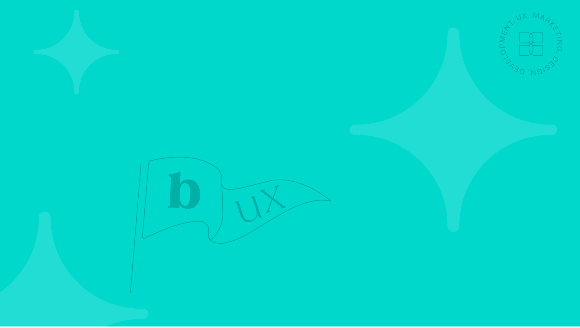
Your Logo: A Flag, Not a Fortress
A logo isn’t everything. 7 reminders about what a logo is and isn’t.
A good logo can do a lot. It can grab attention. Signal credibility. Anchor your brand’s visual identity. But as Ian Paget (Logo Geek) reminds us, your logo isn’t the most important part of your brand.
That might feel like a hot take in a world where logo tweaks become boardroom debates. But he’s right.
Your logo is a flag. Not a fortress.
And definitely not a family crest.
It’s not meant to carry every detail of your history, values, and vision. That’s too much weight for one mark to bear and too much for anyone to remember.
As Paul Rand famously believed (creator of iconic logos for IBM, ABC, and UPS), a great logo should be simple enough for a child to draw from memory.
When your logo tries to say everything, it ends up saying nothing.
So before you zoom in to debate the curve of the “g” or the kerning on line two, take a breath. Let’s zoom out and keep these 7 things in mind:
1. A Logo Is a Signal, Not a Story
It’s meant to spark recognition, not carry the full brand narrative. Let your values, visuals, and voice do the deeper work.
2. Don’t Chase “Perfect”
As the Angry Designers would say, don’t get precious. Obsessing over pixel-perfect details can stall progress. Good enough, done well, and launched on time often wins.
3. Symbols Are Powerful but Consistency Is Stronger
A smart logo without a cohesive system is just a nice mark. What matters more is how consistently and creatively it’s used.
4. It Should Work in the Wild and Scale
Test it in real life. Tiny favicons, embroidery, signage, and mobile views. A logo that only looks good in a deck isn’t done yet.
5. It Will Evolve and That’s Okay
Flags evolve. Logos do too. That doesn’t mean your brand is unstable. It means it’s growing.
6. It’s the Entry Point, Not the End Game
A logo might be the first thing people notice, but it’s rarely what they remember. What they remember is how you made them feel.
7. Don’t Just Design. Define.
Ask deeper questions. What do we stand for. What space do we want to occupy. What makes us different. The best logos don’t just look good. They mean something.
So yes, fly your flag proudly. Make it sharp. Make it yours.
But don’t confuse it for the whole brand.
Design it well.
Then get back to building the nation it represents.
And if you ever want a team who gets that balance, who knows when to sweat the curve of the “g” and when to zoom out, you know where to find us.
Not all friction is bad. The kind in front of your customer costs conversions. The kind inside your team creates better ideas.
An active LinkedIn page is not always necessary. Before you commit, ask what job it would actually do.
Being impossible to ignore is the core Bowen UX mantra. Let’s dive deeper into what this means.
As the year comes to a close, we’re grateful for the work we’ve built together.
The difference between freelance and agency isn’t price. It’s where the thinking lives.
Maybe the box isn’t a limit. It’s a little bit of guidance.
Apple proves it. IKEA proves it. Psychology proves it. Less isn’t empty… it’s impact.
A logo isn’t everything. 7 reminders about what a logo is and isn’t.
It’s the secret sauce Earl Nightingale talked about and how we collaborate and create.
This post unpacks what brand equity really means and how to track it without the fluff.
Our Creativity